
Working Dogs Foundation · Foundation / NGO (#BI_NGO volunteering)
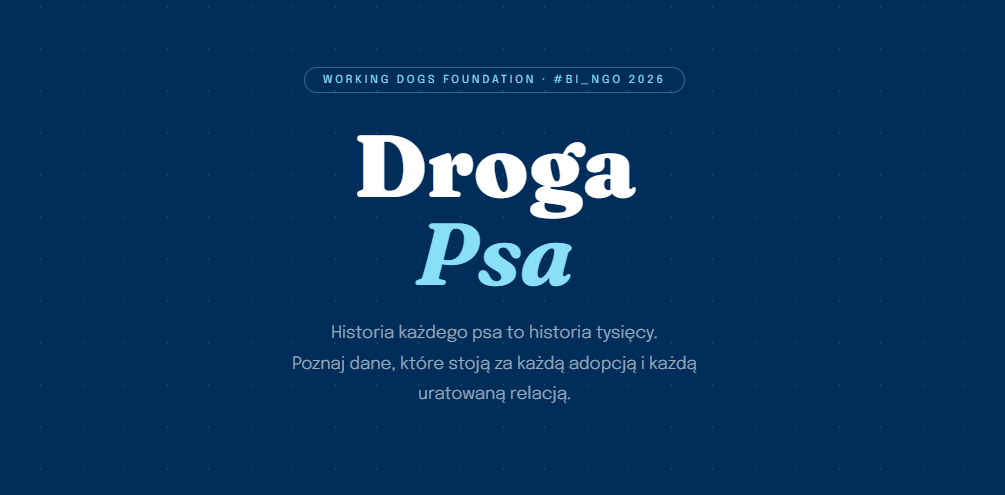
How do you present data about dog homelessness so that people actually want to read it? That was my challenge.
In March 2026 I volunteered for the second edition of #BI_NGO, run by Język Danych – an initiative that connects data professionals with non-profits. Foundations get professional visualisations, and participants get a real project for their portfolio. I warmly encourage you to take part – it is only the second edition, and I hope not the last. You can see all the works from the initiative in the #BI_NGO gallery.
My task was a data visualisation for Working Dogs Foundation – a foundation whose mission is to improve the standard of dogs' lives through educating people. And so „The Dog's Journey” was born: a data story that tells the history of dog homelessness like an article – guiding the reader through the numbers, the foundation's programmes, and quotes from people whose lives were changed by adoption. The data comes from four different sources: GIW, Working Dogs Foundation, FEDIAF and a study by Karmimy Psiaki.

„The Dog's Journey” is not a dry board of charts, but a narrative – one you read like a feature story. I built it from several elements, each meant to lead the reader one step further:

Technical challenges. I wrote all the charts and animations by hand, in pure JavaScript – no libraries at all. Two things proved hardest: the carousel with a smooth, infinite loop, and synchronising data from four sources, each of which collected it with a different methodology. It was groundwork – arranging the numbers so they told one coherent story.


The outcome is a visualisation that does not bore you with tables, but draws you in – and genuinely helps the foundation talk about its mission. Stack: HTML · CSS · JavaScript (vanilla) · PHP.
The project was made for one specific foundation, but the approach is always the same: I deliver a solution tailored to the real needs and possibilities of the audience. And by the way – if you can help, help. It is worth it.
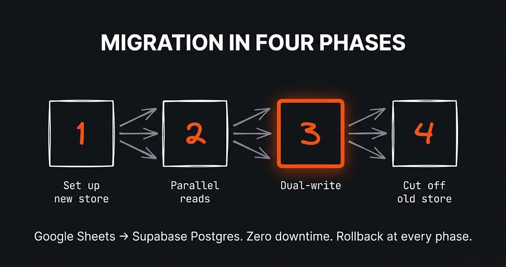
The challenge The app had grown alongside the business for a year and a half. It started as a clever Google Sheet with a few scripts…
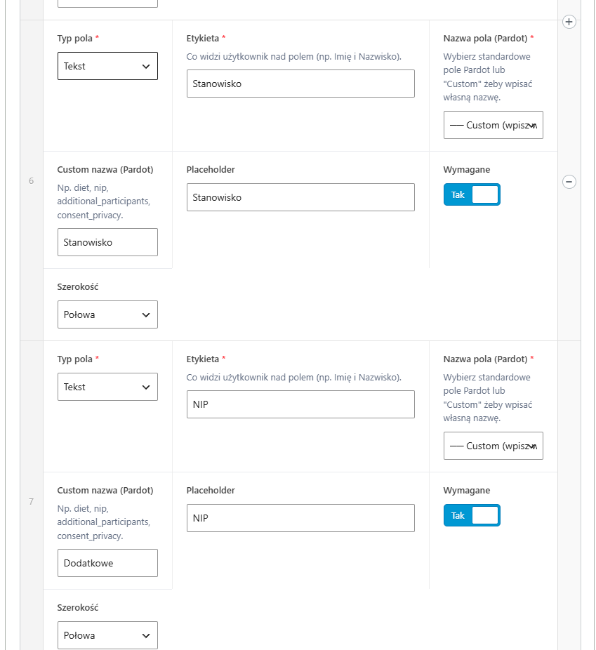
The challenge A large B2B client had many different forms on the site – some for contact, others for webinars, still others…
The challenge The first version of this site was born out of courage. I wrote about it separately – about the perfectionism that…
Just tell me what you need - it does not have to be technical, that is my job. I will get back to you and tell you straight whether and how I can help.